

Create Your Own FONT in Midjourney
Education
Introduction
Creating custom fonts in Midjourney is a fun and straightforward process that anyone can do with just a few steps. Thanks to the contributions of users like "Wonderful World of Stuff," we can easily design personalized letter styles through Discord or the Midjourney website. Here’s a detailed breakdown on how to create your own unique fonts.
Step 1: Crafting Your Foundational Prompt
When beginning the process, you'll want to create a foundational prompt that encompasses several elements:
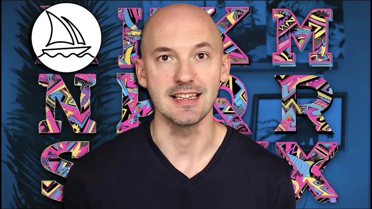
Theme: Choose a theme for your font. It can be as simple as a single word or phrase—avoid being overly complex. Examples include:
- A pirate-themed letter.
- A '90s electric-colored collage-inspired letter.
Outline: Consider including an outline for your font. This can be expressed with terms like "bold black outline," "crisp," "sleek," or "messy."
Background: Specify your background color, ideally black or white, to make isolation of the letters easier.
Your prompt will start to take shape. For example:
- A tie dye letter S font with a black outline on a white background.
- A retro-futuristic themed letter S font with an aesthetic outline on a white background.
Letter Selection: For the purposes of this tutorial, it's recommended to start with the letter "S," but feel free to choose any letter.
Parameters:
- Chaos: Add a small chaos value (2-3) for extra variety.
- Aspect Ratio: Use the aspect ratio parameter
--ar 1x1for a square image.
Example Prompt:A zoo themed letter S font white background --ar 1x1 --chaos 2
Step 2: Generating the Other Letters
After you've created your initial letter, it’s time to generate the other letters in your font:
Copy and Paste Prompt: Take your foundational prompt (excluding the parameters) and replace the "S" with the letters you want to create. You can either process letters one by one or use permutations by inserting curly brackets with letter selections.
Image Address: Go back to your foundational font image, right-click, and select "Copy Image Address."
Update Your Prompt: Add the copied image link to the end of your prompt and include
--iwfollowed by a value (between 1.5 and 3; start with 3).Additional Parameters: Add:
--sref(style reference) with the copied image link.--ssw(style weight) with a value of 1,000.- Keep the aspect ratio at
--ar 1x1.
Final Prompt Example:A zoo themed letter (A, B, C) font white background --iw 3 --sref [Image_Link] --ssw 1000 --ar 1x1
Step 3: Refining Wonky Letters
Not every generated letter will come out perfectly—some letters like "L," "T," and "O" are trickier to create. Here are some methods to enhance them:
Explore Variations: For the closest match, use upscale options to explore subtle and strong variations.
Lower the Image Weight: Run the prompt again with a lower image weight (try 1.5) for better results.
Try Different Style Versions: Change the style version parameter from default (4) to 1, 2, or 3 using the format
(1, 2, 3).
Creating Fonts on the Midjourney Website
Transitioning to the Midjourney website is simpler. You can follow these steps:
- Access the original upscale of your foundational letter.
- Ensure you use the original prompt at the top.
- Replace the letter in the prompt as before.
- Use the image as an image prompt and style reference.
- Add the necessary parameters
--iw 3and--sw 1000.
With this process, you create your custom fonts while ensuring your letters maintain their intended style and theme.
Keyword
- Custom Fonts
- Midjourney
- Discord
- Prompt
- Image Address
- Variations
- Style Reference
- Parameters
FAQ
Q: Can I create lowercase letters?
A: While you can attempt to specify lowercase in your prompts, results with lowercase letters may not consistently be successful.
Q: Is there a specific letter I should start with?
A: It's suggested to start with the letter "S" for ease but feel free to choose others if desired.
Q: What should I do if some generated letters don’t turn out well?
A: You can explore variations, try using a lower image weight, or experiment with different style versions to refine those letters.
Q: How do I ensure my letters are created in the same style?
A: Make sure to use your original image as both an image prompt and style reference throughout the process.
Q: Should I avoid using chaos during the letter generation?
A: Yes, it’s generally best not to add chaos after the initial generation to maintain consistency in your designs.