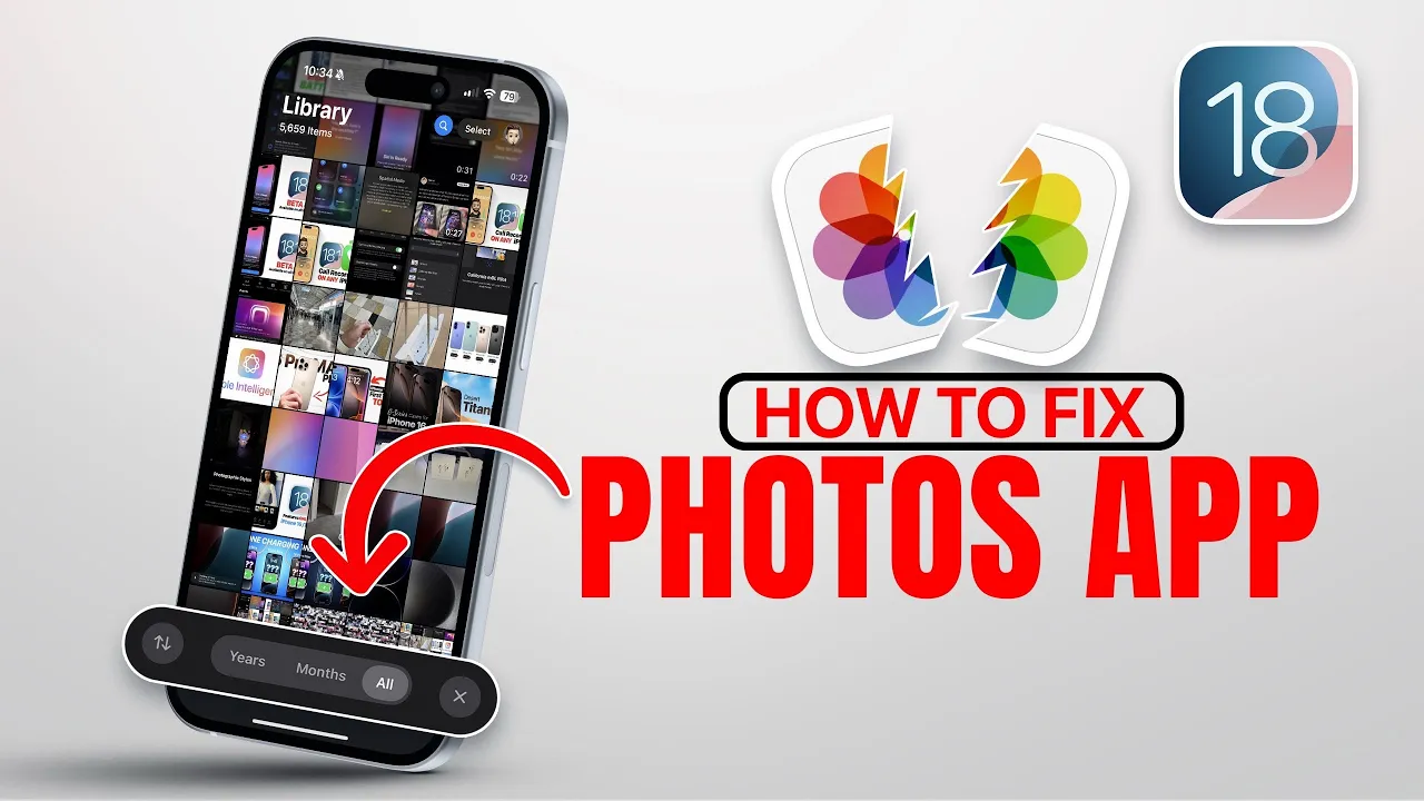
iOS 18 Photos App SUCKS - How To Fix it!
Science & Technology

Introduction
The release of iOS 18 has brought significant changes to the Photos application, leaving users divided in their opinions. Some users love the new design, while others express their frustration with the updates. If you've found yourself among the latter group and miss the simplicity of the iOS 17 Photos app, you're in luck. In this article, we'll explore how to revert the experience to better suit your preferences and simplify your user experience in iOS 18.
Understanding the New Design
According to Apple, the new layout in the Photos app aims to create a seamless scrolling experience. You can browse through your photos, recent days, pinned collections, memories, trips, featured photos, media types, utilities, and wallpaper suggestions. While this approach may seem intuitive to some, many users feel that it has become complex and cluttered.
Customizing the Photos App Interface
Fortunately, the Photos app in iOS 18 is fully customizable. To simplify the user experience and bring back some of the familiarity of the iOS 17 version, follow these steps:
- Open the Photos App: Scroll to the bottom of the interface.
- Access Customize and Reorder Options: Tap on the “Customize” option to view your current categories.
- Rearranging Categories: Here, you can tap and hold on a category to rearrange it. For a simpler experience, I recommend keeping only three categories: Albums, Media Types, and Utilities.
- Removing Unwanted Categories: Remove everything else from your list to reduce the complexity.
Once you've simplified your layout, returning to your photos will feel more straightforward. You will notice the familiar view with years, months, and other sorting options that you enjoyed in iOS 17.
The Simplified Experience Awaits
After customizing, your home screen will now prominently feature Albums, Media Types, and Utilities.
- Albums will show your collections.
- Media Types will categorize your content into videos, selfies, live photos, and more.
- Utilities include hidden items, recently deleted files, duplicates, receipts, etc.
Moreover, you can personalize additional options like hiding the hidden album or displaying featured content from the avatar settings located at the top right of the screen.
This modification will significantly streamline your experience, allowing you to focus on the essentials without being overwhelmed by unnecessary categories.
Let us know your thoughts on the Photos app in iOS 18. Is the customization option helpful for you? Thank you for reading, and we hope these tips will enhance your iOS 18 experience!
Keywords
iOS 18, Photos app, customization, user experience, simplify, iOS 17, Albums, Media Types, Utilities, interface, Apple.
FAQ
Q1: How can I access the customization options in the Photos app?
A1: Open the Photos app, scroll to the bottom, and select the “Customize” option.
Q2: What categories should I keep for a simpler experience?
A2: It’s recommended to keep just three categories: Albums, Media Types, and Utilities.
Q3: Can I rearrange the categories in the Photos app?
A3: Yes, you can tap and hold to rearrange the categories as per your preference.
Q4: What if I want to hide specific albums?
A4: You can hide albums by accessing the settings in your profile avatar at the top right of the screen.
Q5: Will these changes make the Photos app look like it did in iOS 17?
A5: These adjustments will simplify the layout, making it reminiscent of the iOS 17 Photos app experience.

